The Green Dashboard Problem
Soft-launch metrics can be green for the wrong reasons. The question isn't whether the numbers are healthy — it's what made them healthy.

Mobile gaming is in a phase where every install has to work harder. Download growth is slower, UA is still expensive, and AI has made creative testing significantly faster — more creatives, shorter iteration cycles, lower CPI on the surface. But faster creative iteration does not compress the time required to understand whether a product actually holds. It compresses the time to reach a convincing soft-launch signal, which is a different thing.
In this environment, one old soft-launch mistake becomes more expensive than it used to be: trusting a green dashboard before understanding what made it green.
The dual interpretation problem
A soft-launch dashboard can look healthy for entirely the wrong reasons. Not because CPI, D1, D7, Ad ARPDAU, and early ROAS are bad metrics — they are completely necessary. The problem is that each of these numbers can be produced by very different underlying behaviors, and the behaviors that produce a superficially green number at low volume are not always the ones that hold at scale.
Low CPI could mean the concept is strong and the creative is finding genuine audience resonance. It could also mean the creative is overpromising something the game doesn’t actually deliver. Both look identical in the CPI line.
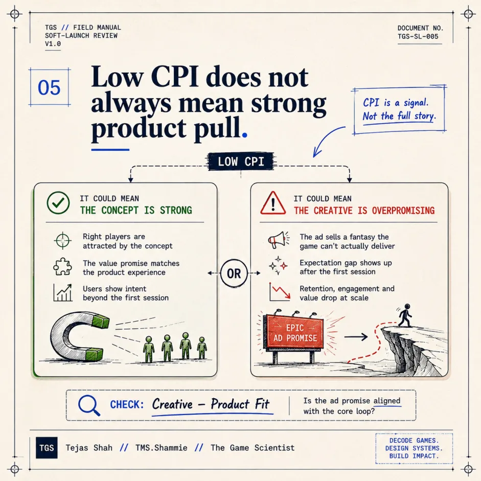
The difference is creative-product fit. When the creative accurately represents the experience — the same visual language, the same interaction model, the same core tension — the audience it attracts is pre-qualified for what the product actually delivers. When the creative optimises for install volume by dramatising the most exciting surface-level hook, it attracts users the product has not been built for. The gap shows up in D3 behavioral depth, which most dashboards do not surface prominently, because the install already looked like a success.
Healthy D1 could mean users understood the core loop and found it engaging enough to form a second-session intent. It could also mean the first session was too guided, too generous with initial rewards, or too dependent on tutorial novelty. A well-designed tutorial that doesn’t connect to a compelling second session is doing expensive work. Users complete it and leave anyway.
Acceptable D7 could mean habit is forming around the core loop. It could also mean the product’s scaffolding is still carrying the user. There is a specific taxonomy of scaffolding mechanisms that commonly inflate early retention:
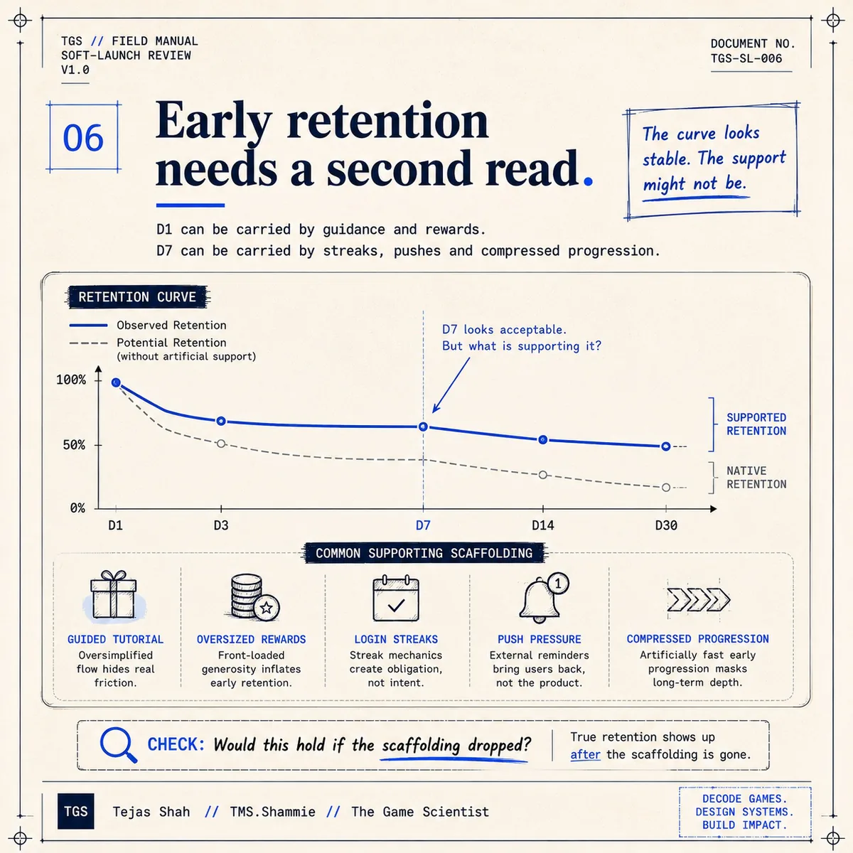
- Guided tutorial — a structured flow that removes friction so completely that the user cannot fail, even if they do not understand what they’re doing
- Oversized early rewards — reward timing calibrated to arrive before any meaningful engagement challenge, so the user’s positive feeling is correlated with the reward, not the core loop
- Login streak bonuses — return mechanisms whose value proposition is the streak itself, not the underlying product experience
- Push pressure — notification volumes calibrated to re-engage users who would not have returned organically
- Compressed early progression — pacing designed to deliver maximum perceived advancement in the first week, which normalises once the compression window closes
Each of these is a legitimate product tool. None of them are dishonest or manipulative by design. The problem is when they are doing the work that the core product experience should be doing. The diagnostic question for D7 is not “is it green?” — it is: would it hold if the scaffolding dropped?
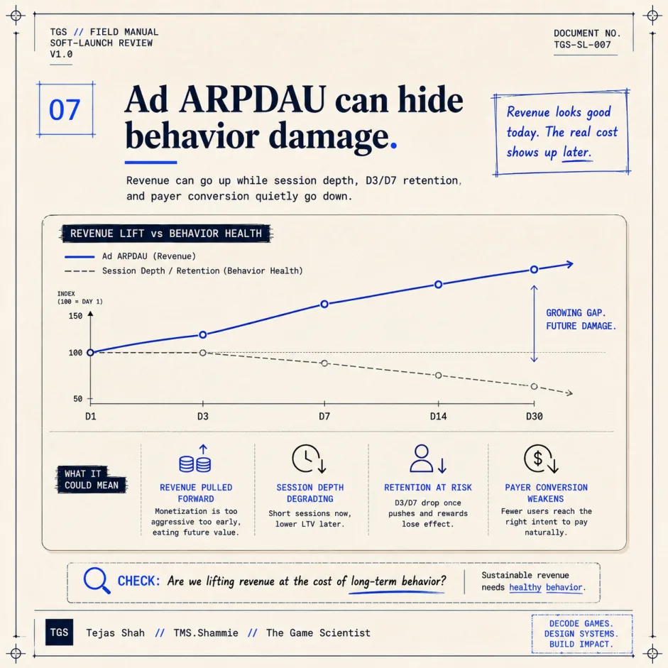
Strong Ad ARPDAU could mean your ad monetization is calibrated well against your user base’s engagement pattern. It could also mean you’re measuring revenue lift without measuring behavior damage.
 These are not the same calculation.
A high-frequency ad format that maximises short-term yield can simultaneously depress session depth, erode return visit frequency, and shift the behavioral profile of the cohort in ways that hurt the monetization you care about more: IAP conversion and long-term session time. The Revenue Lift column shows up immediately. The Behavior Health column takes three to four weeks to appear in the data. Most soft-launch reviews end before that gap becomes visible.
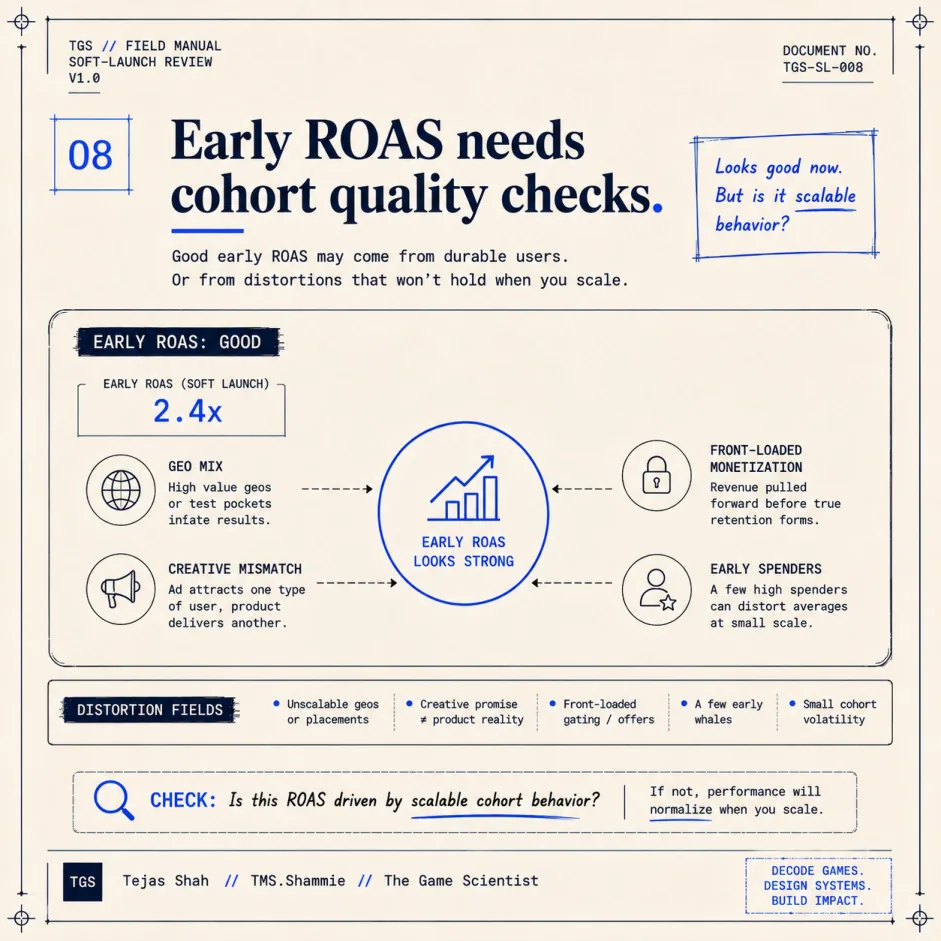
Good early ROAS is the metric that produces the most confident bad decisions. It can reflect genuine cohort quality. It can also reflect geo mix (certain markets are cheaper to acquire but don’t hold LTV), creative mismatch (the audience the creative attracted isn’t the game’s real audience), front-loaded monetization mechanics, or a handful of early spenders creating a misleading aggregate.
The deeper distinction
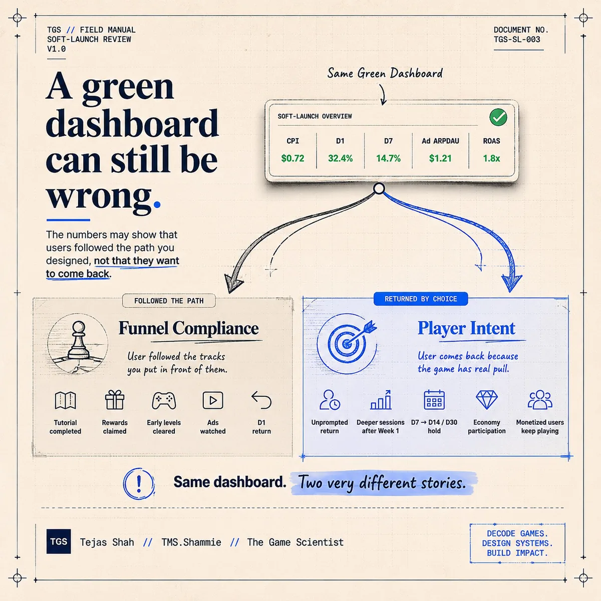
What makes this hard to catch at the review stage is that the metrics themselves are not the problem. Every one of those numbers should be on your soft-launch dashboard. The issue is treating them as a binary: are they green, or aren’t they?
The more useful framing is behavioral. There is a significant difference between:
- A user following the path you designed
- A user returning because the game has actual pull

The first is funnel compliance. The user clicked the next button because you designed the next button well. The tutorial completed because the tutorial was well-paced. D1 held because the first reward arrived before the user could feel friction.
The second is player intent. The user came back on day three not because they were nudged, but because they were in the middle of something they wanted to finish. The distinction is not visible in aggregate retention charts. It requires behavioral depth analysis: session-over-session progression velocity, return visit triggers (notification-driven vs organic), and breadth of core loop engagement in early sessions.
A game with high funnel compliance and low player intent looks great at week one and falls apart at week six. A game with genuinely strong player intent looks messier early — the retention curve has more natural variance because you’re seeing real behavior, not tutorial rails — but it holds at scale.
What a better review asks
The soft-launch review question I’ve found more useful than “are the numbers green” is: what made them green?
Specifically, for each metric that’s hitting threshold, ask what behavioral evidence supports the interpretation you want to believe:
- If D1 is healthy, which features drove depth behavior in first-session users? Do those features connect to a second-session reason to return?
- If D7 is acceptable, how much of it is organic return versus notification-driven? What’s the organic D7 for users who didn’t receive a push in the first week?
- If Ad ARPDAU is strong, what’s the session frequency profile at week 3 versus week 1? Is the yield stable as sessions normalize — or was it pulling forward revenue from engagement that doesn’t persist?
- If ROAS looks good, cut it by geo and by creative audience — does it hold uniformly, or is it being driven by a cluster that won’t replicate at scale?
The answers to those questions are what you’re actually deciding to scale when you move budgets.
The data maturity problem
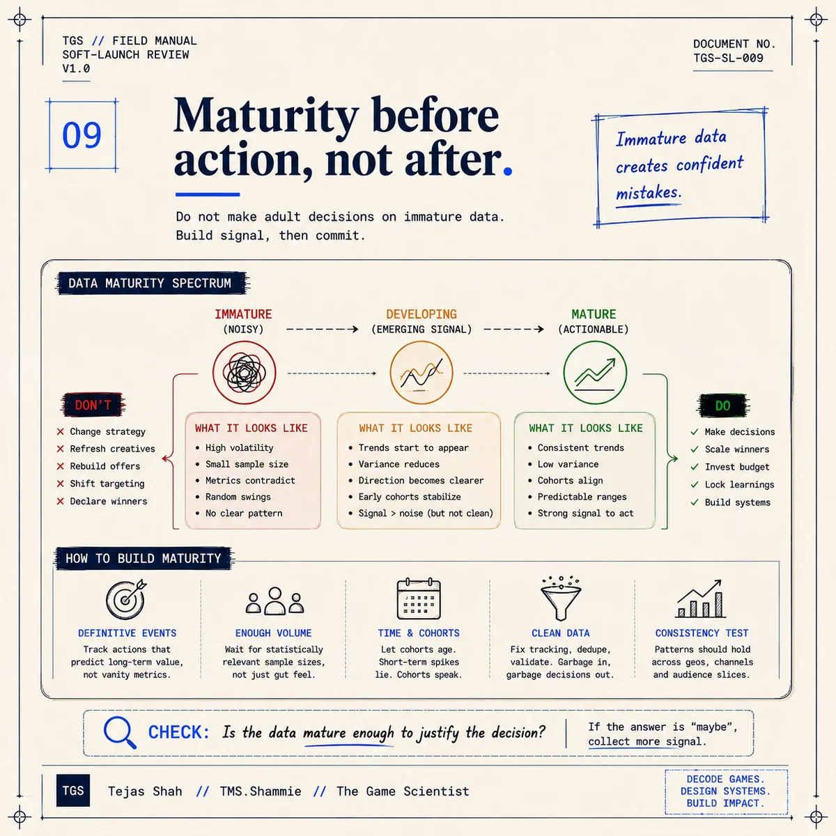
There is an additional layer that most soft-launch reviews don’t account for: the team’s ability to correctly read the data they’re generating is not uniform. And the misconfidence that comes from immature data infrastructure is often more expensive than no data at all.
Immature data infrastructure produces dashboards that show numbers without context. CPI without creative-audience breakdown. D7 without scaffolding-adjusted organic segmentation. Ad ARPDAU without session health correlation. Teams at this stage see the numbers as conclusions when they are actually inputs. The confident-looking green metrics drive confident decisions based on incomplete signals. Immature data creates confident mistakes.
Developing data infrastructure adds segmentation — the team can now cut by geo, creative, or cohort. But interpretation still relies heavily on judgment calls because the behavioral signals aren’t yet structured around the product’s actual decision surface. The data can answer questions if you know exactly what to ask, but it doesn’t yet surface what you should be asking.
Mature data infrastructure is diagnostic by design. The KPIs are structured around the product’s specific mechanics. The segmentation reflects the decisions that actually get made. The behavioral signals connect to the strategic questions. At this stage, the green dashboard problem largely solves itself — because the dashboard isn’t measuring the surface metrics in isolation, it’s measuring the behavioral substrate underneath them.
Most teams at soft launch are at immature or developing — which is appropriate for the stage. The issue is when the review is conducted with the confidence of a mature data setup. The metrics look like conclusions. They are not.
Why this matters more now
Creative testing has become faster and cheaper. That’s a structural improvement for the industry. But it has a side effect: a team can now move from “uncertain concept” to “green soft-launch dashboard” faster than they could three years ago. The mechanics that produce a convincing soft-launch signal — well-paced tutorial, reward timing, early progression compression, notification optimization — are well-understood, well-tooled, and well-practised.
What hasn’t gotten faster is the process of determining whether a game has real pull. That still takes 30–60 days of behavioral data, read at the right level of granularity.
The risk isn’t that teams are doing anything wrong. It’s that the tools for producing a green dashboard have advanced faster than the discipline of interrogating one. The Analytics & KPI Framework work I do is often about closing exactly this gap — building the behavioral layer that sits underneath the standard dashboard metrics and answers the “what made them green” question with something actionable.
Don’t scale the dashboard. Scale the behavior behind it.